ShopDreamUp AI ArtDreamUp
Deviation Actions


![Prowl [+PSD +VIDEO WALTHTHROUGH on PATREON]](https://images-wixmp-ed30a86b8c4ca887773594c2.wixmp.com/f/5a837a0e-fe1c-4e50-92e2-c8b7c6bd1c1c/dddwvnn-ee9491c3-4117-48db-a5db-df818c7aa916.jpg/v1/crop/w_184,h_184,x_0,y_7,scl_0.059915337023771,q_70,strp/prowl___psd__video_walththrough_on_patreon__by_arven92_dddwvnn-92s-2x.jpg?token=eyJ0eXAiOiJKV1QiLCJhbGciOiJIUzI1NiJ9.eyJzdWIiOiJ1cm46YXBwOjdlMGQxODg5ODIyNjQzNzNhNWYwZDQxNWVhMGQyNmUwIiwiaXNzIjoidXJuOmFwcDo3ZTBkMTg4OTgyMjY0MzczYTVmMGQ0MTVlYTBkMjZlMCIsIm9iaiI6W1t7ImhlaWdodCI6Ijw9MTQ3NyIsInBhdGgiOiJcL2ZcLzVhODM3YTBlLWZlMWMtNGU1MC05MmUyLWM4YjdjNmJkMWMxY1wvZGRkd3Zubi1lZTk0OTFjMy00MTE3LTQ4ZGItYTVkYi1kZjgxOGM3YWE5MTYuanBnIiwid2lkdGgiOiI8PTEyODAifV1dLCJhdWQiOlsidXJuOnNlcnZpY2U6aW1hZ2Uub3BlcmF0aW9ucyJdfQ.XI1gJ4HLgENItPMUl9R5gJwTAeWNIHcML_Us-n-Meo4)
![Prowl [+PSD +VIDEO WALTHTHROUGH on PATREON]](https://images-wixmp-ed30a86b8c4ca887773594c2.wixmp.com/f/5a837a0e-fe1c-4e50-92e2-c8b7c6bd1c1c/dddwvnn-ee9491c3-4117-48db-a5db-df818c7aa916.jpg/v1/crop/w_92,h_92,x_0,y_4,scl_0.029957668511885,q_70,strp/prowl___psd__video_walththrough_on_patreon__by_arven92_dddwvnn-92s.jpg?token=eyJ0eXAiOiJKV1QiLCJhbGciOiJIUzI1NiJ9.eyJzdWIiOiJ1cm46YXBwOjdlMGQxODg5ODIyNjQzNzNhNWYwZDQxNWVhMGQyNmUwIiwiaXNzIjoidXJuOmFwcDo3ZTBkMTg4OTgyMjY0MzczYTVmMGQ0MTVlYTBkMjZlMCIsIm9iaiI6W1t7ImhlaWdodCI6Ijw9MTQ3NyIsInBhdGgiOiJcL2ZcLzVhODM3YTBlLWZlMWMtNGU1MC05MmUyLWM4YjdjNmJkMWMxY1wvZGRkd3Zubi1lZTk0OTFjMy00MTE3LTQ4ZGItYTVkYi1kZjgxOGM3YWE5MTYuanBnIiwid2lkdGgiOiI8PTEyODAifV1dLCJhdWQiOlsidXJuOnNlcnZpY2U6aW1hZ2Uub3BlcmF0aW9ucyJdfQ.XI1gJ4HLgENItPMUl9R5gJwTAeWNIHcML_Us-n-Meo4)


Comments15
Join the community to add your comment. Already a deviant? Log In
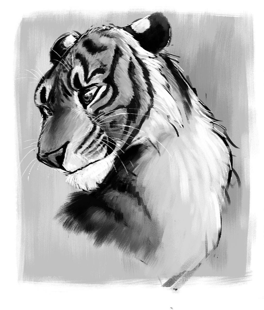
Wow this is just phenomenal! My favourite part about this must be how well you managed to strike that balance between realism and fiction, the character really coming through in the eyes but the fur and the lighting suggests that this tiger is in the real world. The use of your brushes is almost to a professional standard, done with expertise and masterfully applied to create the texture of fur and the markings. Some things that I might have changed is that some parts of the sketch are floating around in the background, as though you thought it didn't look quite right so you rubbed it out but didn't quite rub out all those lines, most prominent around the top of the forehead and just a tad at the base of the neck/chest area, you could try and erase those if you have the time. Personally I would have used a cleaner brush to do the whiskers rather than having them interrupted like they are, as it isn't try to the nature of whiskers whilst are usually thinner and stand out a little more. I also feel like the glint in the eye is a little too strong, perhaps tweak the opacity to about 80%, as it might be a little bit more realistic this way and that way it wouldn't obscure the drawing as whole. And for the background could have been a little bit more defined, as of right now it seems a little out of place with the character being so harshly defined and the background being almost completely translucent. One more thing I might add for further improvement is that you try and some more shade too certain areas, such as underneath the head and over the chest, where the tiger's heads shadow would naturally be. Perhaps varying the shade where the light is not hitting the tigers face and where it is not. This would just make it feel more 3-D and really make him pop! Honestly it was really hard to scrape up those improvements because really I feel my points are just obnoxious haha xD But I wanted to try and help you out so this is what I came up with :3 Honestly I think its one of your best pieces yet <img src="e.deviantart.net/emoticons/b/b…" width="15" height="15" alt="